CIS195 Web Authoring 1: HTML
Using the CSS Grid for Layout
| Topics by Week for the Eight-Week Term | |
|---|---|
| 1. Intro to HTML | 5. Layout with CSS |
| 2. More HTML, file paths | 6. HTML Tables |
| 3. Site structure and navigation | 7. HTML Forms |
| 4. Formatting with CSS, Midterm | 8. Multimedia, Final |
| Topics by Week for the Ten-Week Term | |
|---|---|
| 1. Intro to HTML | 6. Layout with CSS |
| 2. More HTML, file paths | 7. CSS Flexbox and Grid |
| 3. Site structure and navigation | 8. HTML Forms |
| 4. Formatting with CSS | 9. Multimedia |
| 5. Midterm, Project Propposal | 10. Tables, Project Completion |
| 11. Final | |
Contents
Q and AGrid Container ElementsGrid Rows and ColumnsGrid Lines and GapsGrid Template AreasExample CodeReference
Q and A
Update on CSS background images:
CSS
background-size: containandcoverdon't work onbody, you need to use adiv, or other structural element likesection.
Winter registration is open!
Upcoming classes for the Software Development AAS degree programLab 5 on Positioning— any questions?
Code review due today.
Production version due Thursday.
Does anyone have any other questions about anything?
Grid Container Elements
The CSS grid is used to position elements on a page.
The grid needs to be created inside some container element.
The container can be any element that can hold other elements, like
divorsection.The
display: gridordisplay: inline-gridproperty must be applied to the container.This is what makes the element a container for a grid!
The
grid-template-columnsproperty determines the width and number of columns.
For example, this HTML code:
<div style="display: grid; grid-template-columns: auto auto auto;"> <div>Item 1</div> <div>Item 2</div> <div>Item 3</div> <div>Item 4</div> <div>Item 5</div> <div>Item 6</div> <div>Item 7</div> <div>Item 8</div> <div>Item 9</div> </div>Will be displayed like this on the web page:
Item 1 Item 2 Item 3
Item 4 Item 5 Item 6
Item 7 Item 8 Item 9
Note that the three auto values in grid-template-columns: auto auto auto are what specify the three columns and that their width is automatically determined.
Grid Rows and Columns
Columns; the number of columns and the width of each column are specified using the
grid-template-columnproperty as seen above. It can have the following values:auto: the width is determined automatically.max-content: the width is determined by the largest item in the column.min-content: the width is determined by the smallest item in the column.numeric value: any valid CSS width value with units including px, pt, in, em, %, etc.
Rows: The height is specified by the
grid-template-rowproperty.This property can have all the same values as those shown above.
If there are more rows than values, the last value will be applied to the rest of the rows.
Example:
x<!-- in an embedded style sheet --> .container { display: grid; grid-template-columns: 200px 200px 200px; grid-template-rows: 50px 50px; }
<!-- in the body --><div class="container"> <div>Item 1</div> <div>Item 2</div> <div>Item 3</div> <div>Item 4</div> <div>Item 5</div> <div>Item 6</div> <div>Item 7</div> <div>Item 8</div> <div>Item 9</div> </div>
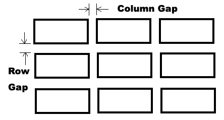
Grid Lines and Gaps
A gap is like a combination of padding and margin in the CSS box model; it's just the space between rows or columns.
Grid gaps are set using one or more of these properties with any valid numeric length value:
column-gap: sets the width of the column gap.row-gap: sets the height of the row gap.gap: sets both the column and row gaps1.
Grid lines are invisible lines that you can use to align things on your grid. They are numbered from left to right and from top to bottom.
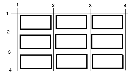
An element can be made to span multiple columns using the column lines as a reference; for example:
xxxxxxxxxx.item2 { grid-column-start: 2; grid-column-end: 4;}An element can be made to span multiple rows using the row lines as a reference; for example:
xxxxxxxxxx.item3 { grid-row-start: 2; grid-row-end: 4;}We can apply these CSS rules like this:
xxxxxxxxxx<div style="display: grid; grid-template-columns: auto auto auto;"> <div>Item 1</div> <div class="item2">Item 2</div> <div class="item3">Item 3</div> <div>Item 4</div> <div>Item 5</div> <div>Item 6</div> <div>Item 7</div> <div>Item 8</div> <div>Item 9</div> </div>Which will look like this on the web page:
Item 1 Item 2
Item 3 Item 4 Item 5
Item 6 Item 7
Item 8 Item 9
Grid Template Areas
The grid-template-areas property in CSS is used to position structural elements within a grid layout. Each element to be positioned must be given a grid-area name. The grid-template-areas property is then used to arrange the named elements into rows and columns like this:
x
<style> .container { display: grid; grid-template-areas: 'header header header' 'menu main sidebar' 'section section sidebar' 'footer footer footer'; }</style>
<div class="container"> <header style="grid-area: header;">header</header> <nav style="grid-area: menu;">menu</nav> <main style="grid-area: main;">main</main> <section style="grid-area: section;">section</section> <aside style="grid-area: sidebar;">sidebar</aside> <footer style="grid-area: footer;">footer</footer> </div>In this example, the div is a grid container that contains a grid with six areas that are specified by the grid-template-areas CSS property. The grid items are placed in the grid container using the grid-area CSS property. The grid items are not placed in the grid container in the order they appear in the HTML. Their order is determined by the order of area names in the grid-template-areas CSS property.
Each grid-area name should only be applied to one element. Note that the grid-template-areas names don't need to match the element names.
Example Code
Open the example web page in your browser and use the View Source feature to look at the source code.
Reference
CSS Grid Tutorial by W3schools
CSS Grid in The CSS Handbook by Flavio Copes
 Web Authoring Lecture Notes, written by Brian Bird in , are licensed under a Creative Commons Attribution-ShareAlike 4.0 International License.